Plotly Charts
Basic Plotly Chart
A widget that demonstrates how to use the Plotly library to create a chart. This gives you the ability to create any interactive type of charts with unlimited flexibility.

@register_widget({
    "name": "Plotly Chart",
    "description": "Plotly chart",
    "type": "chart",
    "endpoint": "plotly_chart",
    "gridData": {"w": 40, "h": 15}
})

@app.get("/plotly_chart")
def get_plotly_chart():
    # Generate mock time series data
    mock_data = [
        {"date": "2023-01-01", "return": 2.5, "transactions": 1250},
        {"date": "2023-01-02", "return": -1.2, "transactions": 1580},
        {"date": "2023-01-03", "return": 3.1, "transactions": 1820},
        {"date": "2023-01-04", "return": 0.8, "transactions": 1450},
        {"date": "2023-01-05", "return": -2.3, "transactions": 1650},
        {"date": "2023-01-06", "return": 1.5, "transactions": 1550},
        {"date": "2023-01-07", "return": 2.8, "transactions": 1780},
        {"date": "2023-01-08", "return": -0.9, "transactions": 1620},
        {"date": "2023-01-09", "return": 1.2, "transactions": 1480},
        {"date": "2023-01-10", "return": 3.5, "transactions": 1920}
    ]

    dates = [datetime.strptime(d["date"], "%Y-%m-%d") for d in mock_data]
    returns = [d["return"] for d in mock_data]
    transactions = [d["transactions"] for d in mock_data]

    # Create the figure with secondary y-axis
    fig = go.Figure()

    # Add the line trace for returns
    fig.add_trace(go.Scatter(
        x=dates,
        y=returns,
        mode='lines',
        name='Returns',
        line=dict(width=2)
    ))

    # Add the bar trace for transactions
    fig.add_trace(go.Bar(
        x=dates,
        y=transactions,
        name='Transactions',
        opacity=0.5
    ))

    # Update layout with axis titles and secondary y-axis
    fig.update_layout(
        xaxis_title='Date',
        yaxis_title='Returns (%)',
        yaxis2=dict(
            title="Transactions",
            overlaying="y",
            side="right"
        ),
        legend=dict(
            orientation="h",
            yanchor="bottom",
            y=1.02,
            xanchor="right",
            x=1
        )
    )

    # Update the bar trace to use secondary y-axis
    fig.data[1].update(yaxis="y2")

    return json.loads(fig.to_json())
Plotly Chart with Theme
This endpoint extends the basic Plotly chart by adding theme support. The theme parameter is automatically provided by OpenBB Workspace based on the user's current display mode (dark/light). This enables dynamic chart styling that matches the workspace theme. The theme parameter is optional - if unused, OpenBB will still pass it but the endpoint will ignore it.
Note: OpenBB widget UI dark mode is #151518 and light mode is #FFFFFF, using these background colors make the chart look consistent with the widgets in the OpenBB Workspace.


@register_widget({
    "name": "Plotly Chart with Theme",
    "description": "Plotly chart with theme",
    "type": "chart",
    "endpoint": "plotly_chart_with_theme",
    "gridData": {"w": 40, "h": 15}
})

@app.get("/plotly_chart_with_theme")
def get_plotly_chart_with_theme(theme: str = "dark"):
    # Generate mock time series data
    mock_data = [
        {"date": "2023-01-01", "return": 2.5, "transactions": 1250},
        {"date": "2023-01-02", "return": -1.2, "transactions": 1580},
        {"date": "2023-01-03", "return": 3.1, "transactions": 1820},
        {"date": "2023-01-04", "return": 0.8, "transactions": 1450},
        {"date": "2023-01-05", "return": -2.3, "transactions": 1650},
        {"date": "2023-01-06", "return": 1.5, "transactions": 1550},
        {"date": "2023-01-07", "return": 2.8, "transactions": 1780},
        {"date": "2023-01-08", "return": -0.9, "transactions": 1620},
        {"date": "2023-01-09", "return": 1.2, "transactions": 1480},
        {"date": "2023-01-10", "return": 3.5, "transactions": 1920}
    ]

    dates = [datetime.strptime(d["date"], "%Y-%m-%d") for d in mock_data]
    returns = [d["return"] for d in mock_data]
    transactions = [d["transactions"] for d in mock_data]

    # Create the figure with secondary y-axis
    fig = go.Figure()

    if theme == "dark":
        # Dark theme colors and styling
        line_color = "#FF8000"  # Orange
        bar_color = "#2D9BF0"   # Blue
        text_color = "#FFFFFF"  # White
        grid_color = "rgba(51, 51, 51, 0.3)"
        bg_color = "#151518"    # Dark background
    else:
        # Light theme colors and styling
        line_color = "#2E5090"  # Navy blue
        bar_color = "#00AA44"   # Forest green
        text_color = "#333333"  # Dark gray
        grid_color = "rgba(221, 221, 221, 0.3)"
        bg_color = "#FFFFFF"    # White background

    # Add the line trace for returns with theme-specific color
    fig.add_trace(go.Scatter(
        x=dates,
        y=returns,
        mode='lines',
        name='Returns',
        line=dict(width=2, color=line_color)
    ))

    # Add the bar trace for transactions with theme-specific color
    fig.add_trace(go.Bar(
        x=dates,
        y=transactions,
        name='Transactions',
        opacity=0.5,
        marker_color=bar_color
    ))

    # Update layout with theme-specific styling
    fig.update_layout(
        xaxis_title='Date',
        yaxis_title='Returns (%)',
        yaxis2=dict(
            title="Transactions",
            overlaying="y",
            side="right",
            gridcolor=grid_color,
            tickfont=dict(color=text_color)
        ),
        legend=dict(
            orientation="h",
            yanchor="bottom",
            y=1.02,
            xanchor="right",
            x=1,
            font=dict(color=text_color)
        ),
        paper_bgcolor=bg_color,
        plot_bgcolor=bg_color,
        font=dict(color=text_color),
        xaxis=dict(
            gridcolor=grid_color,
            tickfont=dict(color=text_color)
        ),
        yaxis=dict(
            gridcolor=grid_color,
            tickfont=dict(color=text_color)
        )
    )

    # Update the bar trace to use secondary y-axis
    fig.data[1].update(yaxis="y2")

    return json.loads(fig.to_json())
Plotly Chart with Theme and Toolbar
This endpoint extends the basic Plotly chart by adding a toolbar to the chart. The toolbar is a set of buttons that allows the user to interact with the chart.
Note: As you can see, all the settings and styling utilized by plotly can be too much boilerplate code, so it is recommended to create a plotly_config.py file and use the functions defined in that file to create the chart.

@register_widget({
    "name": "Plotly Chart with Theme and Toolbar",
    "description": "Plotly chart with Theme and toolbar",
    "type": "chart",
    "endpoint": "plotly_chart_with_theme_and_toolbar",
    "gridData": {"w": 40, "h": 15}
})

@app.get("/plotly_chart_with_theme_and_toolbar")
def get_plotly_chart_with_theme_and_toolbar(theme: str = "dark"):
    # Generate mock time series data
    mock_data = [
        {"date": "2023-01-01", "return": 2.5, "transactions": 1250},
        {"date": "2023-01-02", "return": -1.2, "transactions": 1580},
        {"date": "2023-01-03", "return": 3.1, "transactions": 1820},
        {"date": "2023-01-04", "return": 0.8, "transactions": 1450},
        {"date": "2023-01-05", "return": -2.3, "transactions": 1650},
        {"date": "2023-01-06", "return": 1.5, "transactions": 1550},
        {"date": "2023-01-07", "return": 2.8, "transactions": 1780},
        {"date": "2023-01-08", "return": -0.9, "transactions": 1620},
        {"date": "2023-01-09", "return": 1.2, "transactions": 1480},
        {"date": "2023-01-10", "return": 3.5, "transactions": 1920}
    ]

    dates = [datetime.strptime(d["date"], "%Y-%m-%d") for d in mock_data]
    returns = [d["return"] for d in mock_data]
    transactions = [d["transactions"] for d in mock_data]

    # Create the figure with secondary y-axis
    fig = go.Figure()

    if theme == "dark":
        # Dark theme colors and styling
        line_color = "#FF8000"  # Orange
        bar_color = "#2D9BF0"   # Blue
        text_color = "#FFFFFF"  # White
        grid_color = "rgba(51, 51, 51, 0.3)"
        bg_color = "#151518"    # Dark background
    else:
        # Light theme colors and styling
        line_color = "#2E5090"  # Navy blue
        bar_color = "#00AA44"   # Forest green
        text_color = "#333333"  # Dark gray
        grid_color = "rgba(221, 221, 221, 0.3)"
        bg_color = "#FFFFFF"    # White background

    # Add the line trace for returns with theme-specific color
    fig.add_trace(go.Scatter(
        x=dates,
        y=returns,
        mode='lines',
        name='Returns',
        line=dict(width=2, color=line_color)
    ))

    # Add the bar trace for transactions with theme-specific color
    fig.add_trace(go.Bar(
        x=dates,
        y=transactions,
        name='Transactions',
        opacity=0.5,
        marker_color=bar_color
    ))

    # Update layout with theme-specific styling
    fig.update_layout(
        xaxis_title='Date',
        yaxis_title='Returns (%)',
        yaxis2=dict(
            title="Transactions",
            overlaying="y",
            side="right",
            gridcolor=grid_color,
            tickfont=dict(color=text_color)
        ),
        legend=dict(
            orientation="h",
            yanchor="bottom",
            y=1.02,
            xanchor="right",
            x=1,
            font=dict(color=text_color)
        ),
        paper_bgcolor=bg_color,
        plot_bgcolor=bg_color,
        font=dict(color=text_color),
        xaxis=dict(
            gridcolor=grid_color,
            tickfont=dict(color=text_color)
        ),
        yaxis=dict(
            gridcolor=grid_color,
            tickfont=dict(color=text_color)
        )
    )

    # Update the bar trace to use secondary y-axis
    fig.data[1].update(yaxis="y2")

    # Configure the toolbar and other display settings
    toolbar_config = {
        'displayModeBar': True,
        'responsive': True,
        'scrollZoom': True,
        'modeBarButtonsToRemove': [
            'lasso2d',
            'select2d',
            'autoScale2d',
            'toggleSpikelines',
            'hoverClosestCartesian',
            'hoverCompareCartesian'
        ],
        'modeBarButtonsToAdd': [
            'drawline',
            'drawcircle',
            'drawrect',
            'eraseshape'
        ],
        'doubleClick': 'reset+autosize',
        'showTips': True,
        'watermark': False,
        'staticPlot': False,
        'locale': 'en',
        'showAxisDragHandles': True,
        'showAxisRangeEntryBoxes': True,
        'displaylogo': False,
        'modeBar': {
            'bgcolor': 'rgba(0, 0, 0, 0.1)' if theme == 'light' else 'rgba(255, 255, 255, 0.1)',
            'color': text_color,
            'activecolor': line_color,
            'orientation': 'v',
            'yanchor': 'top',
            'xanchor': 'right',
            'x': 1.05,  # Increased spacing from chart
            'y': 1,
            'opacity': 0,  # Start hidden
            'hovermode': True,  # Show on hover
            'hoverdelay': 0,  # No delay on hover
            'hoverduration': 0  # No delay on hover out
        }
    }

    # Convert figure to JSON and add config
    figure_json = json.loads(fig.to_json())
    figure_json['config'] = toolbar_config

    return figure_json
Plotly Chart with Theme and Config File
This widget demonstrates how to create a chart using the Plotly library and use the config file to minimize the amount of code needed to create the chart.
For reference, here's where this particular plotly_config.py was used: https://github.com/OpenBB-finance/backend-examples-for-openbb-workspace/blob/main/getting-started/reference-backend/plotly_config.py

@register_widget({
    "name": "Plotly Chart with Theme and Toolbar using Config File",
    "description": "Plotly chart with theme and toolbar using config file",
    "type": "chart",
    "endpoint": "plotly_chart_with_theme_and_toolbar_using_config_file",
    "gridData": {"w": 40, "h": 15}
})

@app.get("/plotly_chart_with_theme_and_toolbar_using_config_file")
def get_plotly_chart_with_theme_and_toolbar_using_config_file(theme: str = "dark"):
    # Generate mock time series data
    mock_data = [
        {"date": "2023-01-01", "return": 2.5, "transactions": 1250},
        {"date": "2023-01-02", "return": -1.2, "transactions": 1580},
        {"date": "2023-01-03", "return": 3.1, "transactions": 1820},
        {"date": "2023-01-04", "return": 0.8, "transactions": 1450},
        {"date": "2023-01-05", "return": -2.3, "transactions": 1650},
        {"date": "2023-01-06", "return": 1.5, "transactions": 1550},
        {"date": "2023-01-07", "return": 2.8, "transactions": 1780},
        {"date": "2023-01-08", "return": -0.9, "transactions": 1620},
        {"date": "2023-01-09", "return": 1.2, "transactions": 1480},
        {"date": "2023-01-10", "return": 3.5, "transactions": 1920}
    ]

    dates = [datetime.strptime(d["date"], "%Y-%m-%d") for d in mock_data]
    returns = [d["return"] for d in mock_data]
    transactions = [d["transactions"] for d in mock_data]

    # Get theme colors
    colors = get_theme_colors(theme)

    # Create the figure
    fig = go.Figure()

    # Add the line trace for returns
    fig.add_trace(go.Scatter(
        x=dates,
        y=returns,
        mode='lines',
        name='Returns',
        line=dict(width=2, color=colors["main_line"])
    ))

    # Add the bar trace for transactions
    fig.add_trace(go.Bar(
        x=dates,
        y=transactions,
        name='Transactions',
        opacity=0.5,
        marker_color=colors["neutral"]
    ))

    fig.update_layout(**base_layout(theme=theme))

    # Add secondary y-axis for transactions
    fig.update_layout(
        yaxis2=dict(
            title="Transactions",
            overlaying="y",
            side="right",
            gridcolor=colors["grid"],
            tickfont=dict(color=colors["text"])
        )
    )

    # Update the bar trace to use secondary y-axis
    fig.data[1].update(yaxis="y2")

    figure_json = json.loads(fig.to_json())
    figure_json['config'] = get_toolbar_config()

    return figure_json
Plotly Heatmap
This widget demonstrates that with Plotly you can create any type of chart including heatmaps, scatter plots, line charts, 3d charts, etc. and also demonstrates how parameters can influence a plotly chart.
Note that the theme parameter always comes at the end of the function.

@register_widget({
    "name": "Plotly Heatmap",
    "description": "Plotly heatmap",
    "type": "chart",
    "endpoint": "plotly_heatmap",
    "gridData": {"w": 40, "h": 15},
    "params": [
        {
            "paramName": "color_scale",
            "description": "Select the color scale for the heatmap",
            "value": "RdBu_r",
            "label": "Color Scale",
            "type": "text",
            "show": True,
            "options": [
                {"label": "Red-Blue (RdBu_r)", "value": "RdBu_r"},
                {"label": "Viridis", "value": "Viridis"},
                {"label": "Plasma", "value": "Plasma"},
                {"label": "Inferno", "value": "Inferno"},
                {"label": "Magma", "value": "Magma"},
                {"label": "Greens", "value": "Greens"},
                {"label": "Blues", "value": "Blues"},
                {"label": "Reds", "value": "Reds"}
            ]
        }
    ]
})
@app.get("/plotly_heatmap")
def get_plotly_heatmap(color_scale: str = "RdBu_r", theme: str = "dark"):
    # Create mock stock symbols
    symbols = ['AAPL', 'MSFT', 'GOOGL', 'AMZN', 'TSLA']

    # Create mock correlation matrix directly
    corr_matrix = [
        [1.00, 0.65, 0.45, 0.30, 0.20],  # AAPL correlations
        [0.65, 1.00, 0.55, 0.40, 0.25],  # MSFT correlations
        [0.45, 0.55, 1.00, 0.35, 0.15],  # GOOGL correlations
        [0.30, 0.40, 0.35, 1.00, 0.10],  # AMZN correlations
        [0.20, 0.25, 0.15, 0.10, 1.00]   # TSLA correlations
    ]

    # Get theme colors
    colors = get_theme_colors(theme)

    # Create the figure
    fig = go.Figure()
    # Apply base layout configuration
    layout_config = base_layout(theme=theme)

    # This allows users to modify the layout configuration further
    # in case they want to steer from the default settings.
    layout_config['title'] = {
        'text': "Correlation Matrix",
        'x': 0.5,
        'y': 0.95,
        'xanchor': 'center',
        'yanchor': 'top',
        'font': {'size': 20}
    }
    layout_config['margin'] = {'t': 50, 'b': 50, 'l': 50, 'r': 50}

    # Update figure with complete layout
    fig.update_layout(layout_config)

    # Add the heatmap trace
    fig.add_trace(go.Heatmap(
        z=corr_matrix,
        x=symbols,
        y=symbols,
        colorscale=color_scale,
        zmid=colors["heatmap"]["zmid"],
        text=[[f'{val:.2f}' for val in row] for row in corr_matrix],
        texttemplate='%{text}',
        textfont={"color": colors["heatmap"]["text_color"]},
        hoverongaps=False,
        hovertemplate='%{x} - %{y}<br>Correlation: %{z:.2f}<extra></extra>'
    ))

    # Convert figure to JSON and apply config
    figure_json = json.loads(fig.to_json())
    figure_json['config'] = {
        **get_toolbar_config(),
        'scrollZoom': False  # Disable scroll zoom
    }

    return figure_json
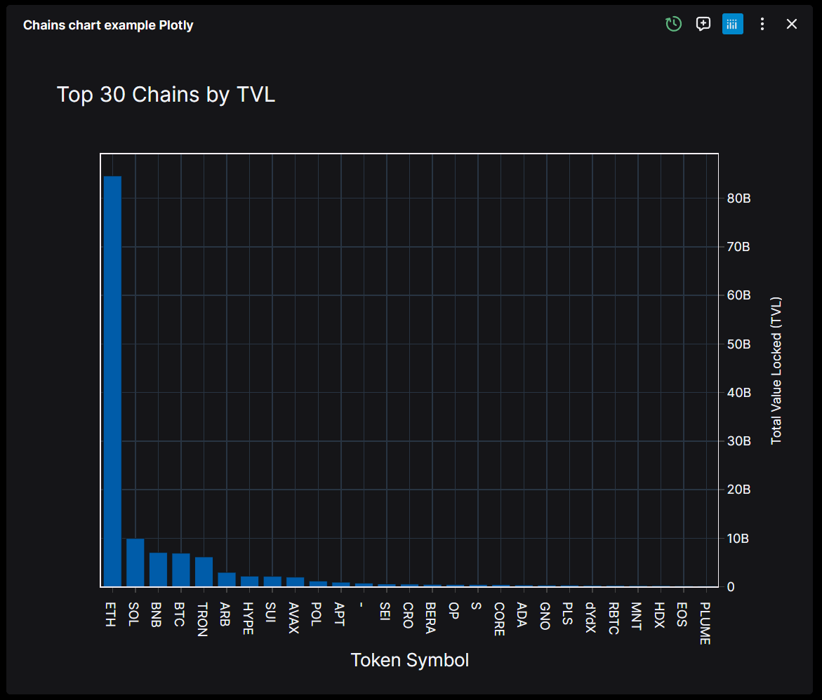
Plotly Chart with Raw Data
This widget demonstrates how to create a Plotly chart that can toggle between displaying the chart visualization and showing the raw data. The button to switch can be found in the top right corner of the widget like seen below.
When raw is True, you will be able to switch between the data on the widget and our copilot will better understand the data in the chart.
@register_widget({
    "name": "Chains Chart Example Plotly with Raw Data",
    "description": "Get current TVL of all chains and plot it with Plotly",
    "type": "chart",
    "endpoint": "chains",
    "gridData": {"w": 40, "h": 9},
    "raw": true,
})

@app.get("/chains")
def get_chains(raw: bool = False, theme: str = "dark"):
    """Get current TVL of all chains using Defi Llama"""
    params = {}
    response = requests.get("https://api.llama.fi/v2/chains", params=params)

    if response.status_code == 200:
        # Create a DataFrame from the JSON data
        df = pd.DataFrame(response.json())

        # OPTIONAL - If raw is True, return the data as a list of dictionaries
        # Otherwise, return the data as a Plotly figure
        # This is useful when you want to make sure the AI can see the data
        if raw:
            return df.to_dict(orient="records")

        # Sort the DataFrame by 'tvl' in descending order and select the top 30
        top_30_df = df.sort_values(by="tvl", ascending=False).head(30)

        # Get theme colors
        colors = get_theme_colors(theme)

        # Create a bar chart using Plotly
        fig = go.Figure()

        fig.add_trace(go.Bar(
            x=top_30_df["tokenSymbol"],
            y=top_30_df["tvl"],
            marker_color=colors["main_line"],
            opacity=0.8
        ))

        # Apply base layout configuration
        layout_config = base_layout(theme=theme)
        layout_config.update({
            'title': {
                'text': "Top 30 Chains by TVL",
                'x': 0.5,
                'y': 0.95,
                'xanchor': 'center',
                'yanchor': 'top',
                'font': {'size': 20}
            },
            'xaxis_title': "Token Symbol",
            'yaxis_title': "Total Value Locked (TVL)",
            'margin': {'t': 80, 'b': 80, 'l': 80, 'r': 80}
        })

        fig.update_layout(layout_config)

        # Convert figure to JSON and apply config
        figure_json = json.loads(fig.to_json())
        figure_json['config'] = get_toolbar_config()

        return figure_json

    print(f"Request error {response.status_code}: {response.text}")
    return JSONResponse(
        content={"error": response.text}, status_code=response.status_code
    )
Additional Resources
For more information on setting up and configuring Plotly charts within the OpenBB Workspace, you can visit the OpenBB Backend Examples for Chart Widgets. This resource provides detailed examples and guidance on how to effectively utilize Plotly for creating interactive and dynamic chart widgets.