AgGrid Table Charts
Basic Table Widget
A widget that displays data in a tabular format. This example shows how to create a table with cryptocurrency data including TVL and price changes.

@register_widget({
    "name": "Table Widget",
    "description": "A table widget",
    "type": "table",
    "endpoint": "table_widget",
    "gridData": {"w": 12, "h": 4},
})
@app.get("/table_widget")
def table_widget():
    """Returns a mock table data for demonstration"""
    mock_data = [
        {
            "name": "Ethereum",
            "tvl": 45000000000,
            "change_1d": 2.5,
            "change_7d": 5.2
        },
        {
            "name": "Bitcoin",
            "tvl": 35000000000,
            "change_1d": 1.2,
            "change_7d": 4.8
        },
        {
            "name": "Solana",
            "tvl": 8000000000,
            "change_1d": -0.5,
            "change_7d": 2.1
        }
    ]
    return mock_data
Table Widget from API
A widget that fetches and displays data from an external API. This example demonstrates integration with the DeFi Llama API to show chain TVL data.

@register_widget({
    "name": "Table Widget from API Endpoint",
    "description": "A table widget from an API endpoint",
    "type": "table",
    "endpoint": "table_widget_from_api_endpoint",
    "gridData": {"w": 12, "h": 4},
})
@app.get("/table_widget_from_api_endpoint")
def table_widget_from_api_endpoint():
    """Get current TVL of all chains using Defi LLama"""
    response = requests.get("https://api.llama.fi/v2/chains")

    if response.status_code == 200:
        return response.json()

    print(f"Request error {response.status_code}: {response.text}")
    raise HTTPException(
        status_code=response.status_code,
        detail=response.text
    )
Table Widget with Column Definitions
A widget that displays data in a tabular format with customizable column definitions. The most important part of this widget is the "columnsDefs" key in the data object which allows for detailed column configuration.

@register_widget({
    "name": "Table Widget with Column Definitions",
    "description": "A table widget with column definitions",
    "type": "table",
    "endpoint": "table_widget_with_column_definitions",
    "gridData": {"w": 20, "h": 6},
    "data": {
        "table": {
            "columnsDefs": [
                {
                    "field": "name",
                    "headerName": "Asset",
                    "cellDataType": "text",
                    "formatterFn": "none",
                    "renderFn": "titleCase",
                    "width": 120,
                    "pinned": "left"
                },
                {
                    "field": "tvl",
                    "headerName": "TVL (USD)",
                    "headerTooltip": "Total Value Locked",
                    "cellDataType": "number",
                    "formatterFn": "int",
                    "width": 150
                },
                {
                    "field": "change_1d",
                    "headerName": "24h Change",
                    "cellDataType": "number",
                    "formatterFn": "percent",
                    "width": 120,
                    "maxWidth": 150,
                    "minWidth": 70,
                },
                {
                    "field": "change_7d",
                    "headerName": "7d Change",
                    "cellDataType": "number",
                    "formatterFn": "percent",
                    "width": 120,
                    "maxWidth": 150,
                    "minWidth": 70,
                    "hide": True
                },
            ]
        }
    },
})
@app.get("/table_widget_with_column_definitions")
def table_widget_with_column_definitions():
    """Returns a mock table data for demonstration"""
    mock_data = [
        {
            "name": "Ethereum",
            "tvl": 45000000000,
            "change_1d": 2.5,
            "change_7d": 5.2
        },
        {
            "name": "Bitcoin",
            "tvl": 35000000000,
            "change_1d": 1.2,
            "change_7d": 4.8
        },
        {
            "name": "Solana",
            "tvl": 8000000000,
            "change_1d": -0.5,
            "change_7d": 2.1
        }
    ]
    return mock_data
Table Widget with Render Functions
A widget that demonstrates various rendering functions for table cells. The key feature is the "renderFn" key in the columnsDefs object which allows for custom cell rendering.

@register_widget({
    "name": "Table Widget with Render Functions",
    "description": "A table widget with render functions",
    "type": "table",
    "endpoint": "table_widget_with_render_functions",
    "gridData": {"w": 20, "h": 6},
    "data": {
        "table": {
            "columnsDefs": [
                {
                    "field": "name",
                    "headerName": "Asset",
                    "cellDataType": "text",
                    "formatterFn": "none",
                    "renderFn": "titleCase",
                    "width": 120,
                    "pinned": "left"
                },
                {
                    "field": "tvl",
                    "headerName": "TVL (USD)",
                    "headerTooltip": "Total Value Locked",
                    "cellDataType": "number",
                    "formatterFn": "int",
                    "width": 150,
                    "renderFn": "columnColor",
                    "renderFnParams": {
                        "colorRules": [
                            {
                                "condition": "between",
                                "range": {
                                    "min": 30000000000,
                                    "max": 40000000000
                                },
                                "color": "blue",
                                "fill": False
                            },
                            {
                                "condition": "lt",
                                "value": 10000000000,
                                "color": "#FFA500",
                                "fill": False
                            },
                            {
                                "condition": "gt",
                                "value": 40000000000,
                                "color": "green",
                                "fill": True
                            }
                        ]
                    }
                },
                {
                    "field": "change_1d",
                    "headerName": "24h Change",
                    "cellDataType": "number",
                    "formatterFn": "percent",
                    "renderFn": "greenRed",
                    "width": 120,
                    "maxWidth": 150,
                    "minWidth": 70,
                },
                {
                    "field": "change_7d",
                    "headerName": "7d Change",
                    "cellDataType": "number",
                    "formatterFn": "percent",
                    "renderFn": "greenRed",
                    "width": 120,
                    "maxWidth": 150,
                    "minWidth": 70,
                }
            ]
        }
    },
})
@app.get("/table_widget_with_render_functions")
def table_widget_with_render_functions():
    """Returns a mock table data for demonstration"""
    mock_data = [
        {
            "name": "Ethereum",
            "tvl": 45000000000,
            "change_1d": 2.5,
            "change_7d": 5.2
        },
        {
            "name": "Bitcoin",
            "tvl": 35000000000,
            "change_1d": 1.2,
            "change_7d": 4.8
        },
        {
            "name": "Solana",
            "tvl": 8000000000,
            "change_1d": -0.5,
            "change_7d": 2.1
        }
    ]
    return mock_data
For more information on this, check Render functions.
Table Widget with Hover Card
A widget that demonstrates the hover card feature, allowing additional information to be displayed when hovering over table cells.

@register_widget({
    "name": "Table Widget with Hover Card",
    "description": "A table widget with hover card",
    "type": "table",
    "endpoint": "table_widget_with_hover_card",
    "gridData": {"w": 20, "h": 6},
    "data": {
        "table": {
            "columnsDefs": [
                {
                    "field": "name",
                    "headerName": "Asset",
                    "cellDataType": "text",
                    "formatterFn": "none",
                    "width": 120,
                    "pinned": "left",
                    "renderFn": "hoverCard",
                    "renderFnParams": {
                        "hoverCard": {
                            "cellField": "value",
                            "title": "Project Details",
                            "markdown": "### {value} (since {foundedDate})\n**Description:** {description}"
                        }
                    }
                },
                {
                    "field": "tvl",
                    "headerName": "TVL (USD)",
                    "headerTooltip": "Total Value Locked",
                    "cellDataType": "number",
                    "formatterFn": "int",
                    "width": 150,
                    "renderFn": "columnColor",
                },
                {
                    "field": "change_1d",
                    "headerName": "24h Change",
                    "cellDataType": "number",
                    "formatterFn": "percent",
                    "renderFn": "greenRed",
                    "width": 120,
                    "maxWidth": 150,
                    "minWidth": 70,
                },
                {
                    "field": "change_7d",
                    "headerName": "7d Change",
                    "cellDataType": "number",
                    "formatterFn": "percent",
                    "renderFn": "greenRed",
                    "width": 120,
                    "maxWidth": 150,
                    "minWidth": 70,
                }
            ]
        }
    },
})
@app.get("/table_widget_with_hover_card")
def table_widget_with_hover_card():
    """Returns a mock table data for demonstration"""
    mock_data = [
        {
            "name": {
                "value": "Ethereum",
                "description": "A decentralized, open-source blockchain with smart contract functionality",
                "foundedDate": "2015-07-30"
            },
            "tvl": 45000000000,
            "change_1d": 2.5,
            "change_7d": 5.2
        },
        {
            "name": {
                "value": "Bitcoin",
                "description": "The first decentralized cryptocurrency",
                "foundedDate": "2009-01-03"
            },
            "tvl": 35000000000,
            "change_1d": 1.2,
            "change_7d": 4.8
        },
        {
            "name": {
                "value": "Solana",
                "description": "A high-performance blockchain supporting builders around the world",
                "foundedDate": "2020-03-16"
            },
            "tvl": 8000000000,
            "change_1d": -0.5,
            "change_7d": 2.1
        }
    ]
    return mock_data
Table to Chart Widget
A widget that demonstrates how to convert table data into a chart view. The key feature is the "chartView" configuration in the data object.

@register_widget({
    "name": "Table to Chart Widget",
    "description": "A table widget",
    "type": "table",
    "endpoint": "table_to_chart_widget",
    "gridData": {"w": 20, "h": 12},
    "data": {
        "table": {
            "enableCharts": True,
            "showAll": False,
            "chartView": {
                "enabled": True,
                "chartType": "column"
            },
            "columnsDefs": [
                {
                    "field": "name",
                    "headerName": "Asset",
                    "chartDataType": "category",
                },
                {
                    "field": "tvl",
                    "headerName": "TVL (USD)",
                    "chartDataType": "series",
                },
            ]
        }
    },
})
@app.get("/table_to_chart_widget")
def table_to_chart_widget():
    """Returns a mock table data for demonstration"""
    mock_data = [
        {
            "name": "Ethereum",
            "tvl": 45000000000,
            "change_1d": 2.5,
            "change_7d": 5.2
        },
        {
            "name": "Bitcoin",
            "tvl": 35000000000,
            "change_1d": 1.2,
            "change_7d": 4.8
        },
        {
            "name": "Solana",
            "tvl": 8000000000,
            "change_1d": -0.5,
            "change_7d": 2.1
        }
    ]
    return mock_data
Table to Time Series Widget
A widget that demonstrates how to display time series data in a chart format. The key feature is the use of "chartDataType": "time" for date fields.

@register_widget({
    "name": "Table to Time Series Widget",
    "description": "A table widget",
    "type": "table",
    "endpoint": "table_to_time_series_widget",
    "gridData": {"w": 20, "h": 12},
    "data": {
        "table": {
            "enableCharts": True,
            "showAll": False,
            "chartView": {
                "enabled": True,
                "chartType": "line"
            },
            "columnsDefs": [
                {
                    "field": "date",
                    "headerName": "Date",
                    "chartDataType": "time",
                },
                {
                    "field": "Ethereum",
                    "headerName": "Ethereum",
                    "chartDataType": "series",
                },
                {
                    "field": "Bitcoin",
                    "headerName": "Bitcoin",
                    "chartDataType": "series",
                },
                {
                    "field": "Solana",
                    "headerName": "Solana",
                    "chartDataType": "series",
                }
            ]
        }
    },
})
@app.get("/table_to_time_series_widget")
def table_to_time_series_widget():
    """Returns a mock table data for demonstration"""
    mock_data = [
        {
            "date": "2024-06-06",
            "Ethereum": 1.0000,
            "Bitcoin": 1.0000,
            "Solana": 1.0000
        },
        {
            "date": "2024-06-07",
            "Ethereum": 1.0235,
            "Bitcoin": 0.9822,
            "Solana": 1.0148
        },
        {
            "date": "2024-06-08",
            "Ethereum": 0.9945,
            "Bitcoin": 1.0072,
            "Solana": 0.9764
        },
        {
            "date": "2024-06-09",
            "Ethereum": 1.0205,
            "Bitcoin": 0.9856,
            "Solana": 1.0300
        },
        {
            "date": "2024-06-10",
            "Ethereum": 0.9847,
            "Bitcoin": 1.0195,
            "Solana": 0.9897
        }
    ]
    return mock_data
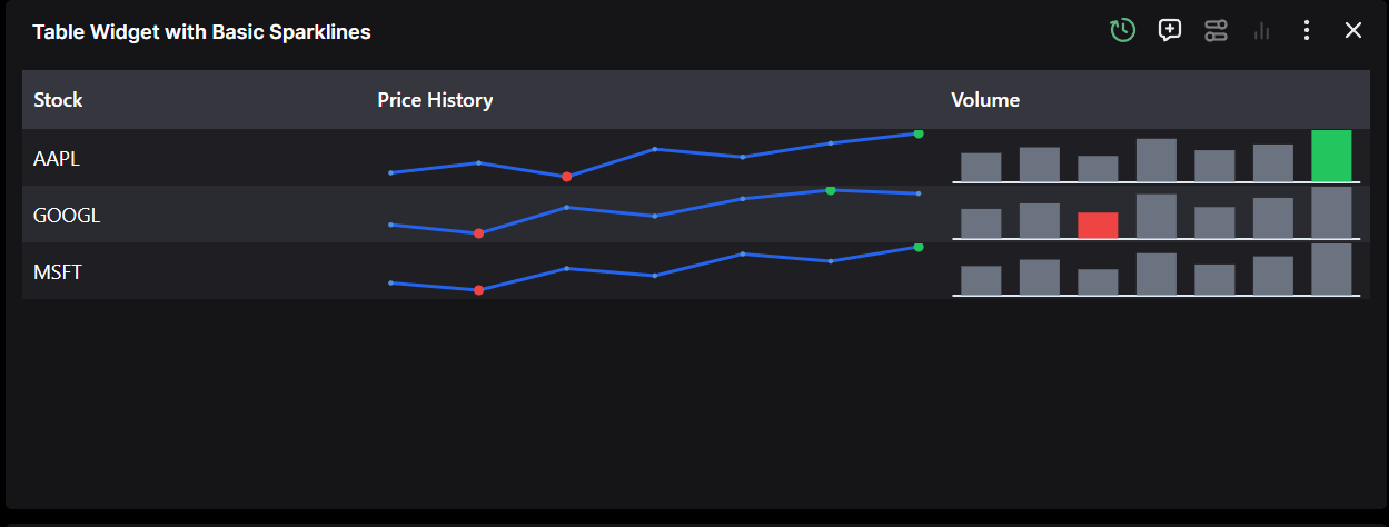
Table Widget with Sparklines
Sparklines allow you to display small charts directly within table cells, providing at-a-glance data visualization. Our implementation supports line, area, and bar sparklines with comprehensive styling options.
Basic Sparkline with Min/Max Points
This example shows a basic sparkline with minimum and maximum points highlighted:
@register_widget({
    "name": "Table Widget with Basic Sparklines",
    "description": "A table widget with basic sparklines showing min/max points",
    "type": "table",
    "endpoint": "table_widget_basic_sparklines",
    "gridData": {"w": 20, "h": 6},
    "data": {
        "table": {
            "columnsDefs": [
                {
                    "field": "stock",
                    "headerName": "Stock",
                    "cellDataType": "text",
                    "width": 120,
                    "pinned": "left"
                },
                {
                    "field": "price_history",
                    "headerName": "Price History",
                    "width": 200,
                    "sparkline": {
                        "type": "line",
                        "options": {
                            "stroke": "#2563eb",
                            "strokeWidth": 2,
                            "markers": {
                                "enabled": True,
                                "size": 3
                            },
                            "pointsOfInterest": {
                                "maximum": {
                                    "fill": "#22c55e",
                                    "stroke": "#16a34a",
                                    "size": 6
                                },
                                "minimum": {
                                    "fill": "#ef4444",
                                    "stroke": "#dc2626",
                                    "size": 6
                                }
                            }
                        }
                    }
                },
                {
                    "field": "volume",
                    "headerName": "Volume",
                    "width": 150,
                    "sparkline": {
                        "type": "bar",
                        "options": {
                            "fill": "#6b7280",
                            "stroke": "#4b5563",
                            "pointsOfInterest": {
                                "maximum": {
                                    "fill": "#22c55e",
                                    "stroke": "#16a34a"
                                },
                                "minimum": {
                                    "fill": "#ef4444",
                                    "stroke": "#dc2626"
                                }
                            }
                        }
                    }
                }
            ]
        }
    },
})
@app.get("/table_widget_basic_sparklines")
def table_widget_basic_sparklines():
    """Returns mock data with sparklines"""
    mock_data = [
        {
            "stock": "AAPL",
            "price_history": [150, 155, 148, 162, 158, 165, 170],
            "volume": [1000, 1200, 900, 1500, 1100, 1300, 1800]
        },
        {
            "stock": "GOOGL",
            "price_history": [2800, 2750, 2900, 2850, 2950, 3000, 2980],
            "volume": [800, 950, 700, 1200, 850, 1100, 1400]
        },
        {
            "stock": "MSFT",
            "price_history": [340, 335, 350, 345, 360, 355, 365],
            "volume": [900, 1100, 800, 1300, 950, 1200, 1600]
        }
    ]
    return mock_data
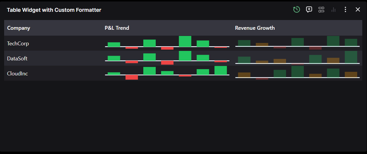
Sparklines with Custom Formatters
For complete control over styling individual data points, use custom formatters. This example shows profit/loss data with dynamic coloring:
@register_widget({
    "name": "Table Widget with Custom Formatter",
    "description": "A table widget with custom sparkline formatter for profit/loss",
    "type": "table",
    "endpoint": "table_widget_custom_formatter",
    "gridData": {"w": 20, "h": 6},
    "data": {
        "table": {
            "columnsDefs": [
                {
                    "field": "company",
                    "headerName": "Company",
                    "cellDataType": "text",
                    "width": 150,
                    "pinned": "left"
                },
                {
                    "field": "profit_loss",
                    "headerName": "P&L Trend",
                    "width": 200,
                    "sparkline": {
                        "type": "bar",
                        "options": {
                            "customFormatter": "(params) => ({ fill: params.yValue >= 0 ? '#22c55e' : '#ef4444', stroke: params.yValue >= 0 ? '#16a34a' : '#dc2626' })"
                        }
                    }
                },
                {
                    "field": "revenue_growth",
                    "headerName": "Revenue Growth",
                    "width": 200,
                    "sparkline": {
                        "type": "bar",
                        "options": {
                            "customFormatter": "(params) => ({ fill: params.yValue > 10 ? '#22c55e' : params.yValue < 0 ? '#ef4444' : '#f59e0b', fillOpacity: 0.3, stroke: params.yValue > 10 ? '#16a34a' : params.yValue < 0 ? '#dc2626' : '#d97706' })"
                        }
                    }
                }
            ]
        }
    },
})
@app.get("/table_widget_custom_formatter")
def table_widget_custom_formatter():
    """Returns mock data with custom formatter"""
    mock_data = [
        {
            "company": "TechCorp",
            "profit_loss": [5, -2, 8, -3, 12, 7, -1],
            "revenue_growth": [15, 8, -5, 20, -8, 25, 18]
        },
        {
            "company": "DataSoft",
            "profit_loss": [10, -5, 15, -8, 20, 12, -3],
            "revenue_growth": [12, 5, 8, -2, 15, 10, 22]
        },
        {
            "company": "CloudInc",
            "profit_loss": [8, -15, 25, 12, -5, 18, 28],
            "revenue_growth": [8, -3, 12, 18, 6, 14, 9]
        }
    ]
    return mock_data
Sparkline Configuration Options
Supported Sparkline Types
line- Line chartarea- Area chart (filled line)bar- Bar chart
Points of Interest
firstLast- First and last data pointsminimum- Points with minimum valuesmaximum- Points with maximum valuespositiveNegative- Separate styling for positive and negative valueshighlighted- Points highlighted on hover/interaction
Custom Formatter Parameters
The formatter function receives parameters including:
yValue- The data valuefirst- Whether this is the first pointlast- Whether this is the last pointmin- Whether this is a minimum pointmax- Whether this is a maximum pointhighlighted- Whether this point is highlighted
Styling Options
- Basic styling:
stroke,strokeWidth,fill,fillOpacity - Markers:
enabled,size,fill,stroke,strokeWidth - Padding:
top,right,bottom,left - Direction:
vertical,horizontal(for bar charts)
For more detailed configuration options, refer to the Widgets JSON Reference or our examples backends here.
OTHERS
Table Interface
The Table widget offers comprehensive data manipulation and visualization capabilities:
-
Column Resizing: Adjust column widths manually or use the "Autosize all columns" feature for automatic optimization.
-
Column Reorganization: Implement drag-and-drop functionality to reorder columns. Click and hold any column header to reposition it.
-
Column Filtering: Toggle column visibility through column settings to focus on relevant data for your analysis.
-
Sorting: Click column headers to sort data in ascending or descending order.
-
Data Selection: Select specific data points or ranges to generate visualizations.
Table to Chart Conversion
The widget supports two primary methods for converting table data into charts:
- Selection-based Charting: Select desired data points, choose a chart type, and generate visualizations instantly. This feature is particularly useful for quantitative analysis.
The example below demonstrates data selection and right-click menu options for creating a line chart:
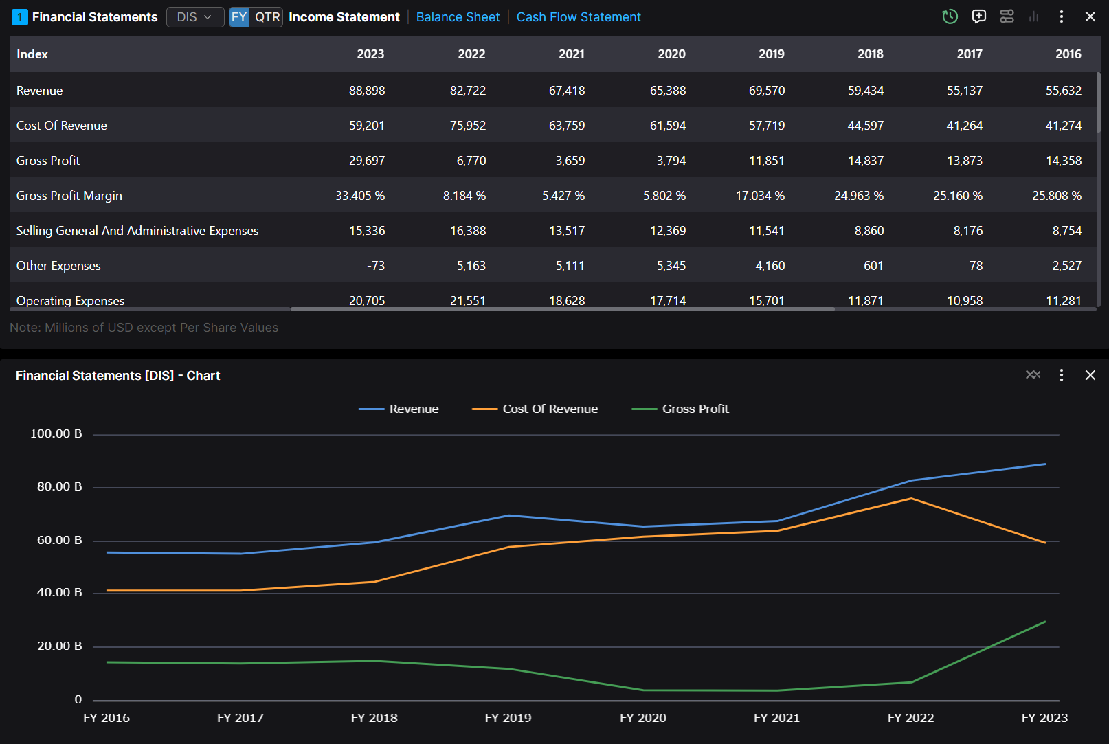
- ChartView Mode: Access the "ChartView" icon to transform the table into a dynamic chart. This mode automatically updates the visualization as underlying data changes.
The following example shows the ChartView interface:
The highlighted ChartView option enables seamless conversion between table and chart views.
Available Chart Types
The built-in charts support a variety of types. Here are the allowed values:
- Column Charts:
column,groupedColumn,stackedColumn,normalizedColumn - Bar Charts:
bar,groupedBar,stackedBar,normalizedBar - Line and Scatter Charts:
line,scatter,bubble - Pie and Donut Charts:
pie,donut,doughnut - Area Charts:
area,stackedArea,normalizedArea - Other Types:
histogram,radarLine,radarArea,nightingale,radialColumn,radialBar,sunburst,rangeBar,rangeArea,boxPlot,treemap,heatmap,waterfall
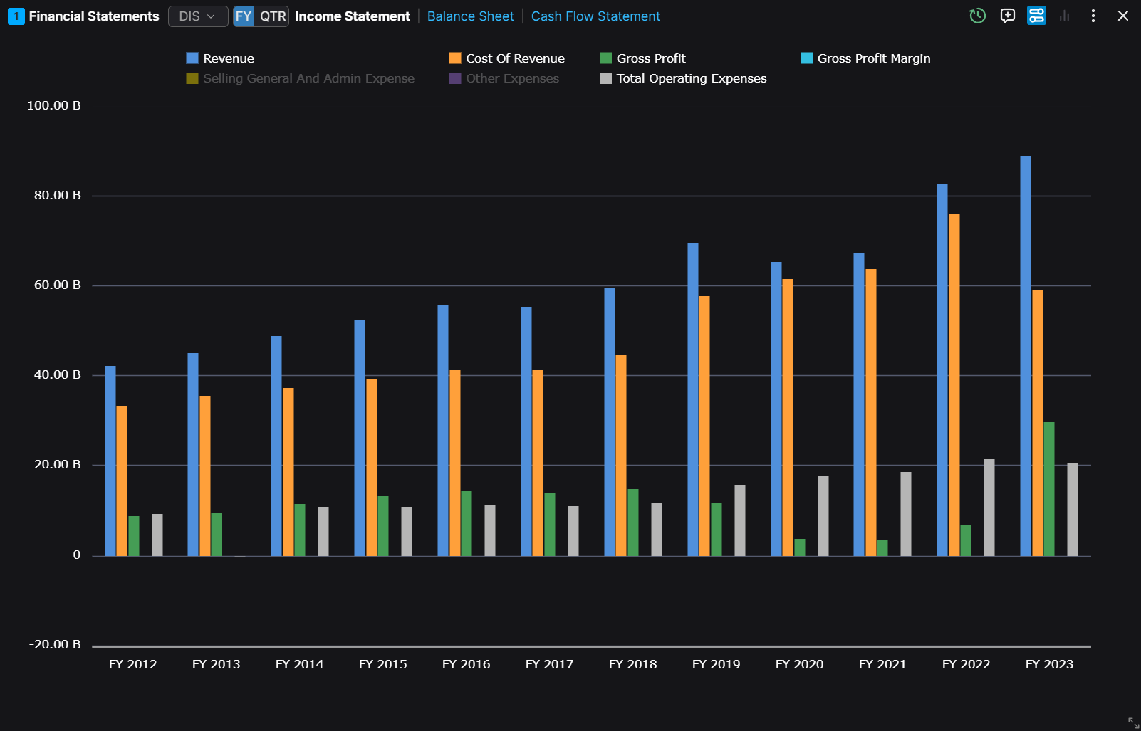
Chart Customization
You can change the chart settings by clicking on the three dots and then the Chart Settings in the dropdown menu.
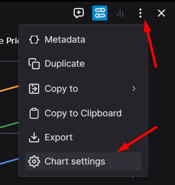
Here you can change the chart type, the chart settings, and some other settings in each tab.
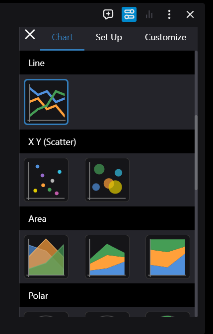
The customization interface provides three main configuration areas:
- Visual Customization: Modify chart appearance, including titles, colors, and styling elements.
- Data Series Management: Control the visibility and configuration of data series.
- Chart Type Selection: Choose from various chart types to best represent your data.
Example of a customized chart with multiple visualization types:
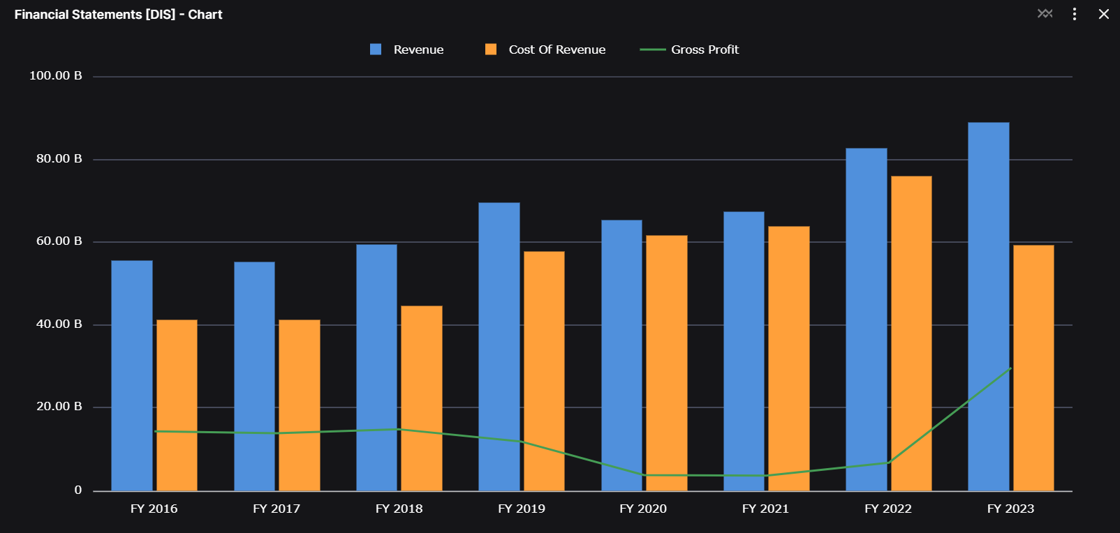
The final example demonstrates how to combine different chart types for enhanced data visualization.