Native Chart
This guide will walk you through the process of creating a simple chart widget using the native charting already available in OpenBB Terminal Pro.
Any table widget can be converted to a chart widget by adding the chartView property to the table section - this allows you to seamlessly switch between table and chart views.
This guide will walk you through the process using the same example as the table widget.
Step 1: Create a table widget
Copy/Use the Table Widget from the Table Widget
Review/Create Widget: The table section of the widgets.json file should be structured as follows:
...
"table": {
    "showAll": true,
    "columnsDefs": [
        {
            "headerName": "Name",
            "field": "name",
            "chartDataType": "category"
        },
        {
            "headerName": "Total Value Locked",
            "field": "tvl"
        },
        {
            "headerName": "Token Symbol",
            "field": "tokenSymbol",
            "chartDataType": "category"
        }
    ]
}
Step 2: Add the chartView Property
To enable the chart view for the widget add the chartView property to the table section. Set the chartType to bar and enabled to true to activate the chart by default.
"table": {
    "chartView": {
        "enabled": true,
        "chartType": "bar"
    },
    "showAll": false,
    "columnsDefs": [
        {
            "headerName": "Name",
            "field": "name",
            "chartDataType": "category"
        },
        {
            "headerName": "Total Value Locked",
            "field": "tvl"
        },
        {
            "headerName": "Token Symbol",
            "field": "tokenSymbol",
            "chartDataType": "category"
        }
    ]
}
You should now have a chart widget that looks like this:

You can now switch between table and chart views by clicking the Chart View icon in the top right corner of the widget (blue highlighted icon top right).
Available Chart Types
The built-in charts support a variety of types. Here are the allowed values:
- Column Charts:
column,groupedColumn,stackedColumn,normalizedColumn - Bar Charts:
bar,groupedBar,stackedBar,normalizedBar - Line and Scatter Charts:
line,scatter,bubble - Pie and Donut Charts:
pie,donut,doughnut - Area Charts:
area,stackedArea,normalizedArea - Other Types:
histogram,radarLine,radarArea,nightingale,radialColumn,radialBar,sunburst,rangeBar,rangeArea,boxPlot,treemap,heatmap,waterfall
By following these steps, you can create a chart widget with ease. Experiment with different chart types to best visualize your data.
Changing the Chart Settings / Visualization
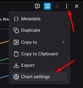
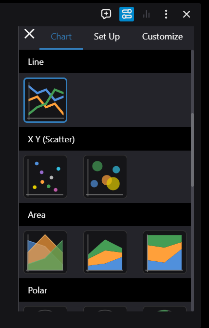
You can change the chart settings by clicking on the three dots and then the Chart Settings in the dropdown menu.

Here you can change the chart type, the chart settings, and the some other settings in each tab.
