Widgets
Widgets are the unit that you will be using with OpenBB Terminal.
We consider something a widget when:
- It has data, either static (e.g. document) or dynamic (e.g. API)
- Metadata has been set (title, description, category, sub category and source)
- It has an associated visual layer
Having said that, there are two main type of widgets.
Types of Widgets
We have OpenBB Core widgets. These widgets don't contain data by themselves, until you select the data you want to utilize.
Once you do that, they may appear on the dashboard and be used by the OpenBB Copilot - e.g. Note widget with text.
However, they don't become a real widget - that can be searched later on - until the metadata is filled in (the title at least).
Examples of OpenBB Core widgets include: Table widget, Image widget, PDF widget, Note, RSS Feed, Website/Iframe, Navigation bar, and clock.
As for the other type of widgets, these are called Packaged data and come from a specific data vendor.
Widget Structure
This is the typical structure of a widget.
- Title: The title identifies the widget. Hovering on top shows the description and the source of where the data comes from.
- Staleness Indicator: When the user hovers on the indicator it shows how recent the data is: Green if updated within the last 30 seconds; Yellow if updated between 30 seconds and 5 minutes ago; Red oif updated over 5 minutes ago. If the user wants to get latest data for a particular widget all that is needed is clicking in the indicator icon to fetch/refresh the data.
- Symbol: Some widgets are associated with a symbol. Changing this symbol updates the table content to reflect the new symbol.
- Group: If multiple widgets belong to the same group, updating the symbol in one will automatically update the symbol in the others. When you click on the group icon, you can set a new group for the current widget.
When widgets are grouped, they share the same color and number in the group icon. You can see which dashboards have which groupings by looking at the text below the dashboard title in the sidebar.
Here's a short introduction to the grouping concept.
Manipulating data
In the realm of investment research, financial data often comes in tabular form. This is because it's predominantly quantitative, and analysts and quants frequently need to delve into the raw data to make informed decisions. To enhance your navigation experience through this data, we've incorporated basic data manipulation capabilities.
-
Column Resizing: You have the flexibility to manually adjust the width of the table columns. Alternatively, you can use the "Autosize all columns" feature for automatic resizing.
-
Column Reorganization: Reorganize your columns effortlessly with our drag-and-drop feature. Simply click and hold the mouse on the column header and drag it to your desired position.
-
Column Filtering: To reduce visual clutter, you can temporarily hide any columns that aren't currently relevant to your analysis. This can be done easily in the column settings.
-
Sorting: By clicking on a column header, you can sort the data in ascending or descending order based on that column's values.
-
Transposing: Our platform allows you to transpose tables, turning columns into rows and vice versa. This feature can be particularly useful for rendering time series from tabular data.
Live Chart
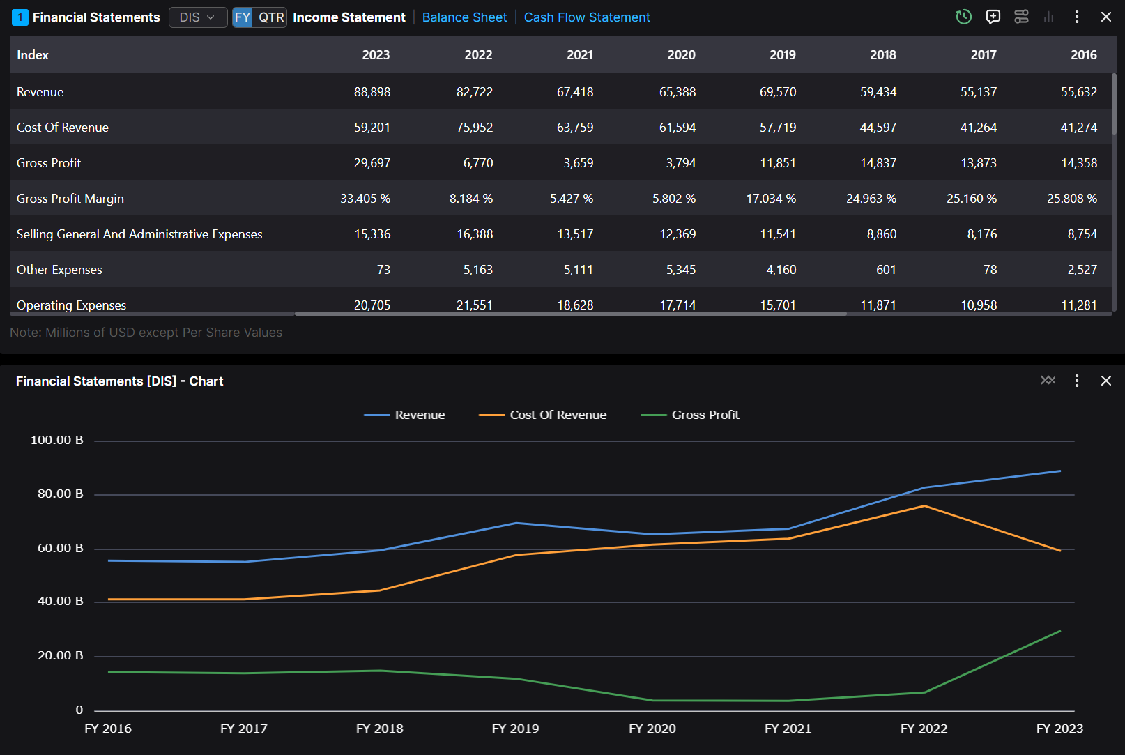
By utilizing the button on the top right corner, users are able to have access to the data in a chart form. And that chart is updated based on the data being updated.
Static Chart
In the world of investment research, data is king. But raw, tabular data can be overwhelming and difficult to interpret. That's where charts come in. They transform complex data sets into visual narratives, making it easier to spot trends, compare variables, and make informed decisions.
With OpenBB Terminal, you can create charts directly from your tabular data in two ways.
-
Simply select the data you want to visualize, choose your preferred charting style, and let the software do the rest. It's a powerful tool for quants and analysts alike.
-
If available pm the widget, you can click on the "ChartView" icon and we will generate a chart for you. The biggest advantage here is that the data will update automatically and be reflected in your chart.

- In this example we've highlighted some data and with a simple "right-click" you can pick a line chart.

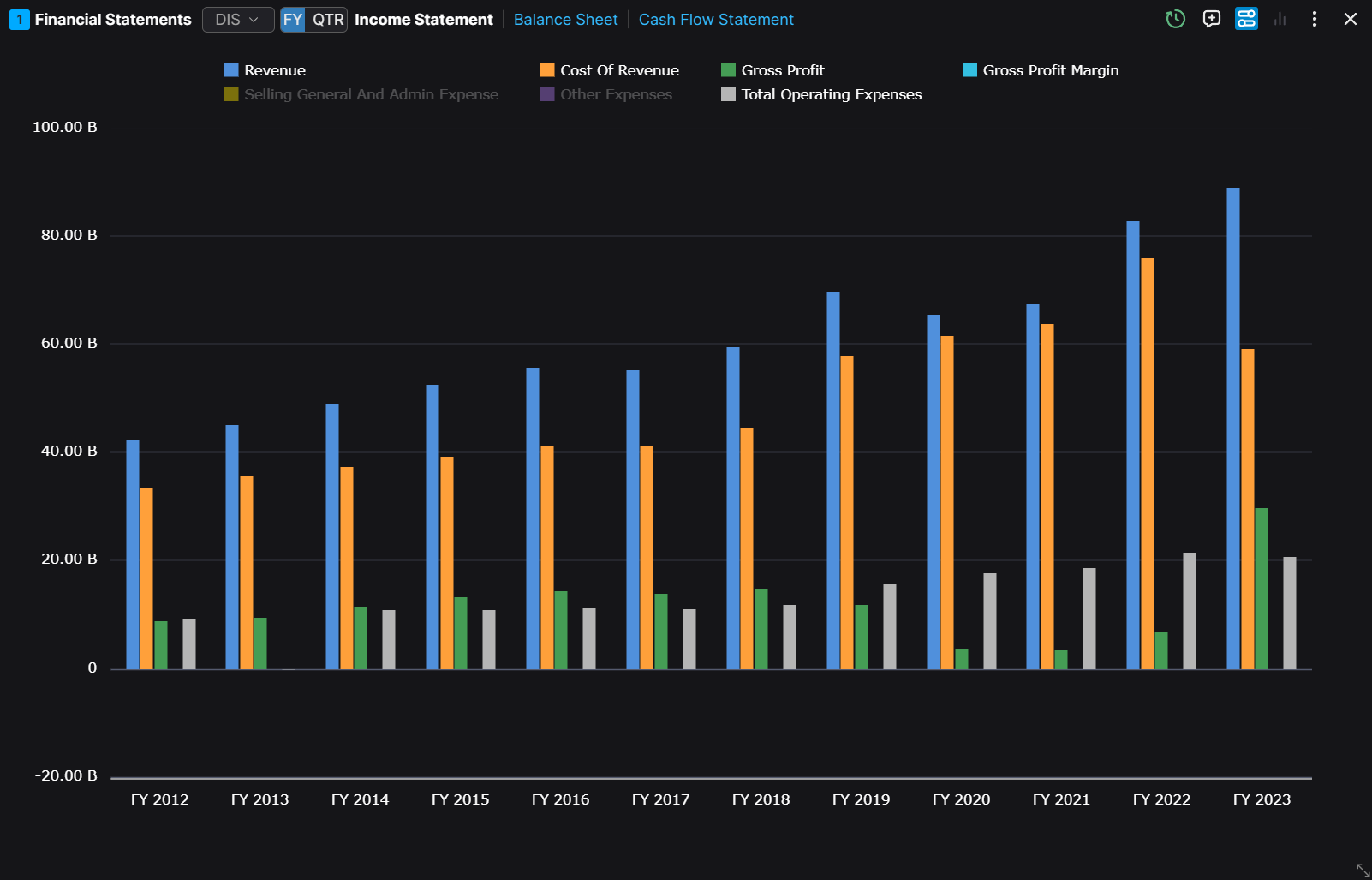
- In this example we're utilizing the "ChartView" highlighted in blue. This allows us to change the widget into a chart instead of a table.

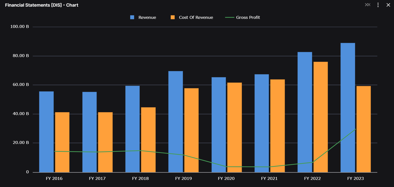
- Finally we're customizing the chart to show a different way then a simple line.
OpenBB Core Widgets
Table
The Table widget was highlighted previously, in the Widget Structure section.
Chart
@TODO get a similar cheatsheet for charts like shared above for tables
When a chart is created you can customize almost anything within it by clicking on the three dots and then Chart Settings.

Once you bring up the "Customize" tab on your chart, you'll have a tab like below to change anything from title to colors. In the other tabs you'll also be able to change what series are shown on the chart in the "Set Up" tab and the chart type under the "Chart" tab. All of these customizations let you create beautiful visualizations.

Note
The Note Widget lets you quickly jot down notes, insights, and observations directly in your dashboard. It’s ideal for capturing key information during research, tracking important points, or storing prompts for the OpenBB Copilot.

Did you know that you can enhance your experience by adding Notes as context to OpenBB Copilot and using them as prompts? It’s a powerful way to track prompts and seamlessly integrate your insights into your workflow.

Website and Iframe
Often, during your research workflow, you need to browse multiple websites to extract data. The Website widget is a versatile tool that lets you embed and interact with websites directly within your dashboard, making it easy to access data from various sources all within the Terminal.
Please note that some websites may disable this functionality. We will automatically check and display the website only if permitted by the site owner.

Clock
Use our Clock Widget to track multiple time zones simultaneously. It lets you monitor the current time in key financial hubs worldwide, helping you stay on top of market hours and coordinate effectively with international teams.

RSS Feeds
The RSS Feeds Widget is an excellent way to stay up-to-date with the latest news directly within your dashboard. We provide a curated list of top news sources right out of the box, but the true power lies in the ability to customize your RSS feeds. You can add any feeds that are relevant to your research workflow, ensuring you always have the most relevant information at your fingertips.

Navigation bar
The Navigation Bar lets you add and manage multiple tabs within your dashboard, making it easier to organize and navigate through your information.

Data widgets
Beyond the OpenBB Core widgets, the OpenBB team has created custom widgets tailored to the specific data they want to offer users. These widgets do not follow the standard table or chart formats mentioned above.
Charting
Our charting widget is powered by the renowned TradingView charting library, offering you a comprehensive and intuitive platform for financial analysis. With this feature, you can access all the functionalities typically available on TradingView. To get the most out of this feature, we recommend familiarizing yourself with TradingView's capabilities here: TradingView
The charting technology is provided by TradingView. Follow the most important cryptos like bitcoin usd, eth usd and much more.
Here's a quick rundown of what you can do with our charting feature:
-
Adjust the time interval and timeline based on your preferred data vendor
-
Utilize TradingView's robust suite of technical analysis indicators for in-depth market insights
-
Access a variety of editing tools for annotations, line drawings, measurements, Fibonacci retracements, and more
-
Overlay charts of other tickers of interest, whether they're in forex, crypto, equity, or macroeconomics
It also allows users to Overlay Financials:
When analyzing equity data, you'll notice the "Financial" text above the chart. This powerful tool allows you to overlay financial data (e.g., revenue, cost of goods, etc.) over time, providing a visual representation of how financials impact the equity price trajectory. It's a powerful way to understand the correlation between a company's financial performance and its stock price.
Watchlist and grouping
The watchlist widget has a special property in relation to grouping. Since this widget doesn't have a single symbol but many, users can select the row of their ticker of interest, and widgets that are grouped with the watchlist will get updated accordingly.
If a user selects a new ticker in another widget that is grouped with the watchlist, that ticker will be added to the watchlist and will become the one selected by default.
News and ticker
When scrolling our news widgets, we allow you to quickly pull information for a company and create a dashboard to do more in depth research. Simply hover on the ticker and you will get a popup like below. Clicking on "Create dashboard for ..." will pull up our Equity or ETF Dashboard, allowing you to perform in depth research with just a few clicks.

TradingView widgets
TradingView widgets are not native, and therefore that means that the data within them won't be accessible to your AI copilot, unlike others.