Interacting With Data
OpenBB Workspace provides powerful tools for analysts to explore and visualize financial data through interactive tables and charts.
Working With Parameters
Parameters are the foundation of interactive analysis in OpenBB Workspace, allowing you to customize what data your widgets display.
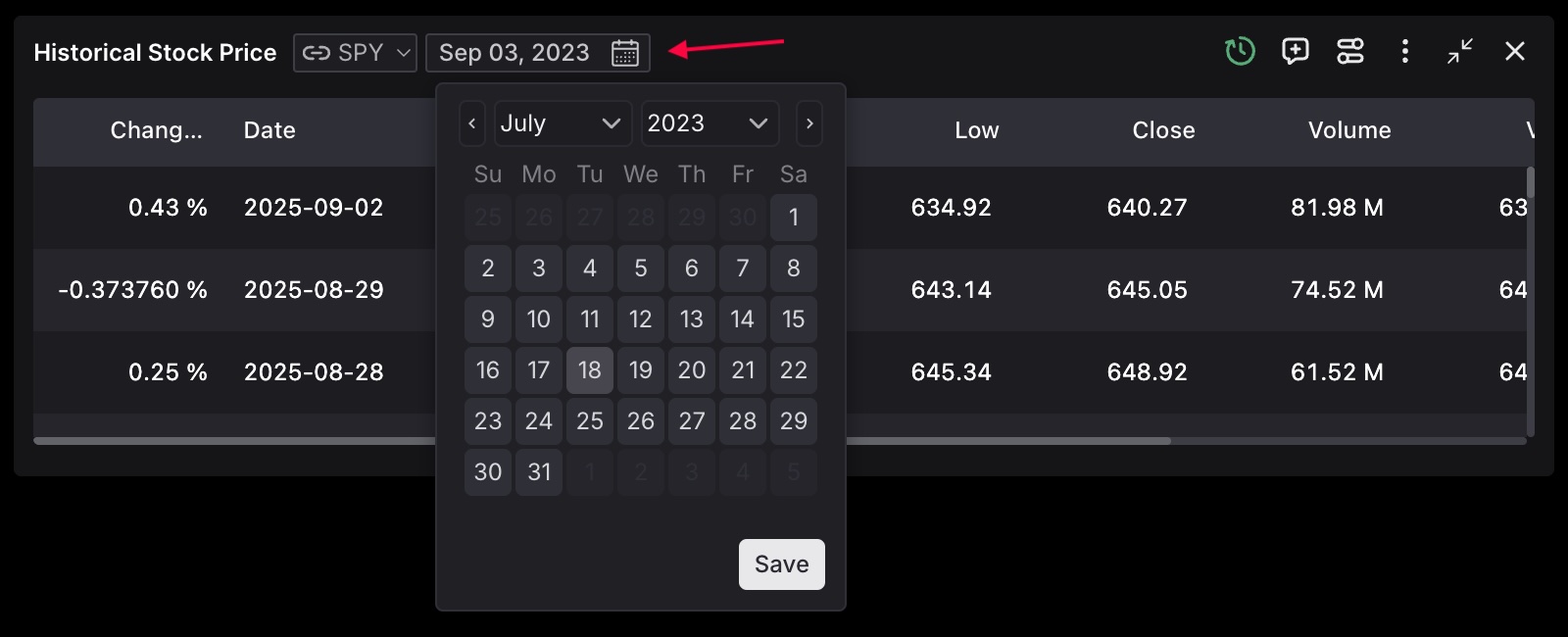
Input parameters let you focus your analysis by setting date ranges, selecting specific tickers, or applying filters that narrow down the dataset to exactly what you need.
Grouping Widgets Through Parameter Linking
A powerful feature of parameters is their ability to be linked across multiple widgets. When widgets share parameter names and options, changing a value in one widget automatically updates all linked widgets, creating a cohesive analytical experience.
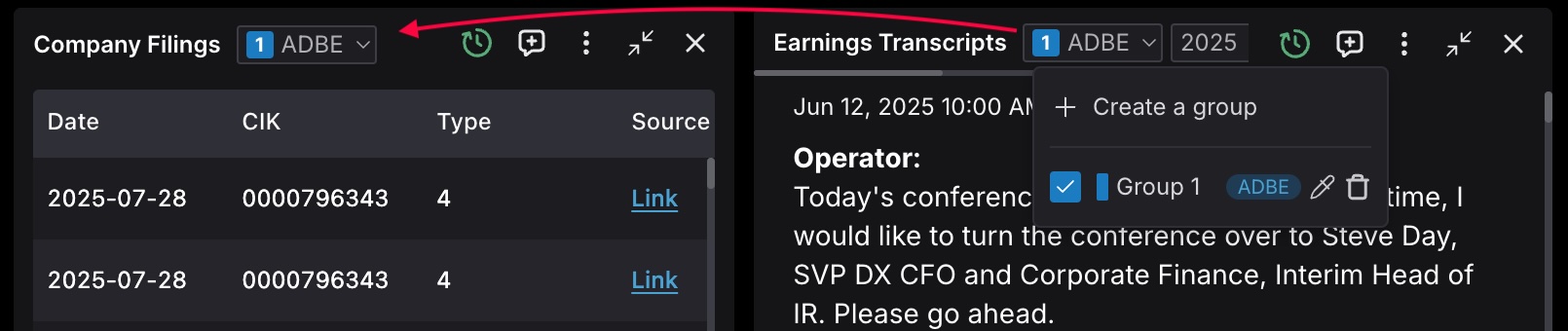
For example, when you change a ticker symbol or date range in one widget, all widgets in the same group that use that parameter will update automatically. This synchronization ensures your entire analysis remains focused on the same context without manual intervention.
This capability transforms your dashboard from a collection of isolated visualizations into an intelligent, responsive workspace where your analytical focus drives all data presentation.
Interactive Tables
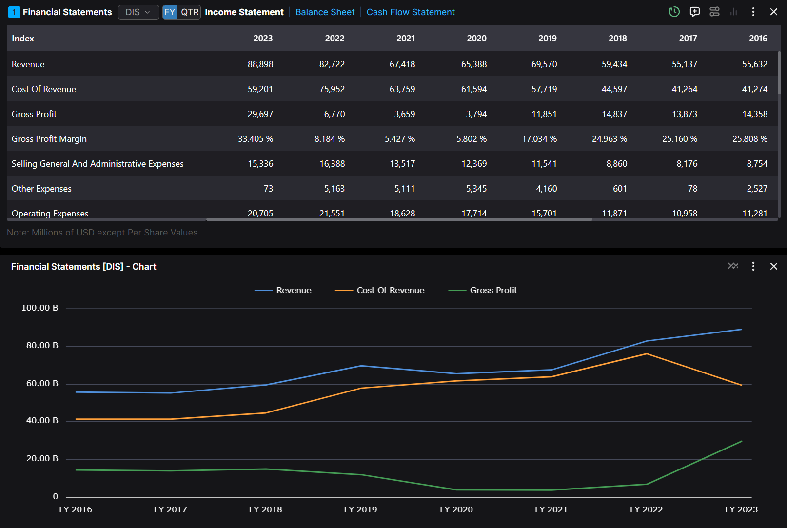
Interactive tables provide powerful data manipulation capabilities for detailed financial analysis. These tables have professional-grade features that allow you to explore and analyze large datasets.
Key Features
- Column Management: Resize and reorder to focus on relevant data
- Sorting and filtering: Click column headers to sort and filter data
- Data Selection: Select specific data points or ranges to generate visualizations
- Sparklines: Visualize trends directly within table cells using line, area, and bar sparklines
- Hover Cards: Access additional context and detailed information on specific data points
- Chart-view Mode: Transform the entire table into a dynamic chart with a single click
Table to Chart Conversion
The widget interface supports conversion between table and chart views, enabling you to switch between detailed data exploration and visual trend analysis as needed.
- Selection-based Charting: Select desired data points, choose a chart type, and generate visualizations instantly
- Chart-view Mode: Access the "Chart-view" icon to transform the entire table into a dynamic chart

Chart Customization
You can change the chart settings by clicking on the three dots and then the Chart Settings in the dropdown menu.
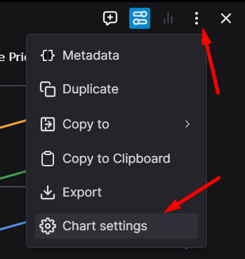
Here you can change the chart type, the chart settings, and some other settings in each tab.
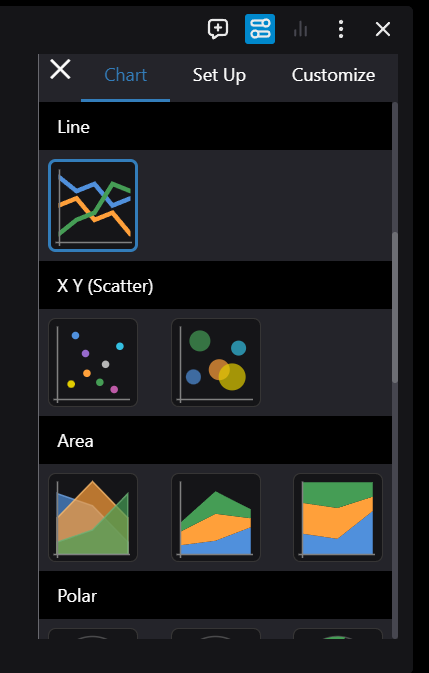
The customization interface provides three main configuration areas:
- Visual Customization: Modify chart appearance, including titles, colors, and styling elements.
- Data Series Management: Control the visibility and configuration of data series.
- Chart Type Selection: Choose from various chart types to best represent your data.
Example of a customized chart with multiple visualization types:
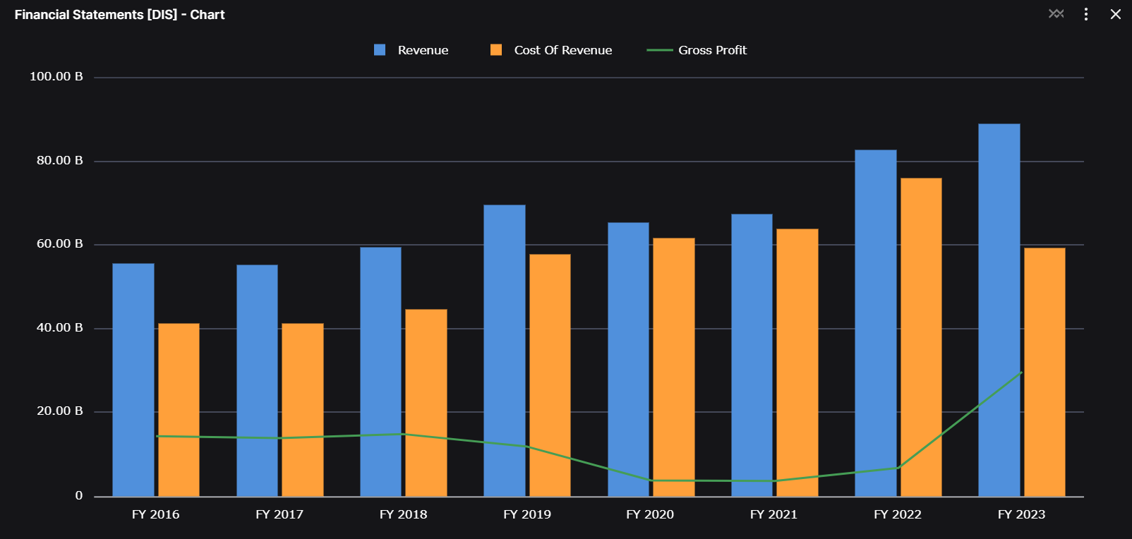
The final example demonstrates how to combine different chart types for enhanced data visualization.
Plotly Charts
Plotly charts give your developers complete freedom to create the right visualization for your data, whether you need a simple line chart or a complex 3D plot. The integration is straightforward, with charts automatically adapting to your workspace theme in both light and dark modes.
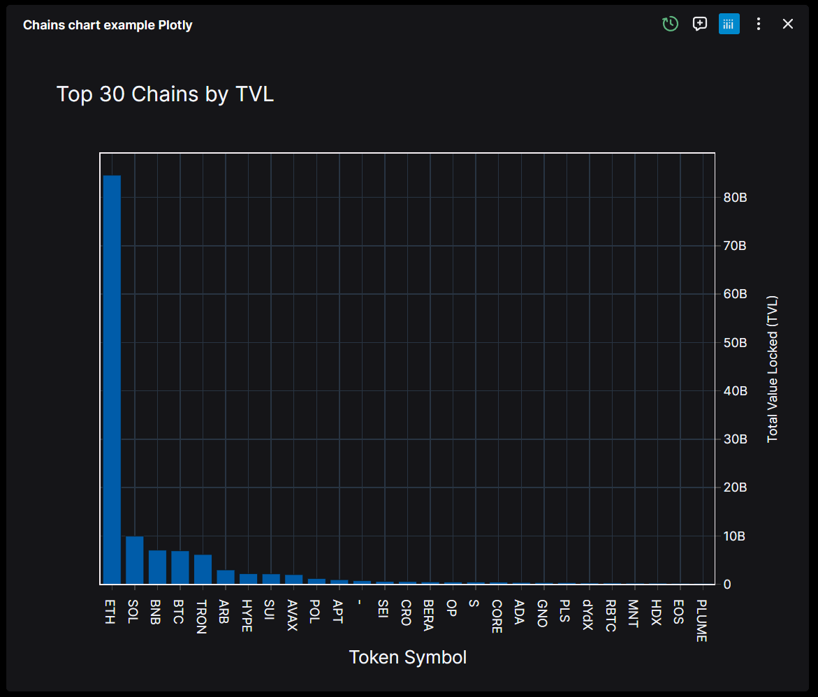
As a user you will find everything you need for in-depth analysis: interactive toolbars with drawing tools and annotations.
Raw Data Toggle
The raw data toggle is particularly useful for AI-assisted analysis. With a simple switch in the top-right corner, you can move between the visual representation and the underlying dataset. This gives the AI copilot direct access to the numbers behind the chart while keeping your dashboard clean and focused on insights.
TradingView Charts
TradingView charts bring professional trading visualization tools directly into your workspace, using the same interface that traders around the world rely on for their analysis.

You get the full TradingView experience: real-time and historical market data, technical indicators, and all the drawing tools you need for your analysis. Whether you're drawing trend lines, applying Fibonacci retracement levels, or highlighting chart patterns, everything works just like it does in the native TradingView platform. The ability to switch between timeframes makes it easy to zoom in on short-term movements or step back for a broader market view.